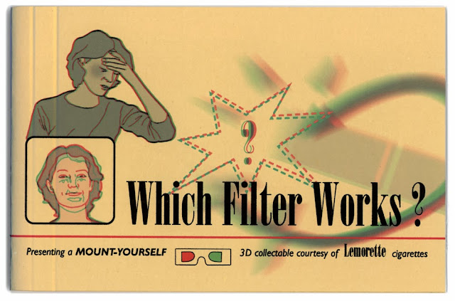
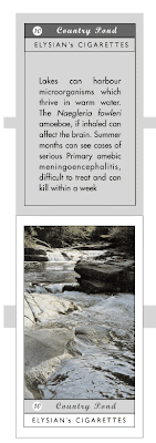
The book was produced in an edition of 7 printed on 130gm cartridge paper, the cover is yellow card and the cigarette cards are printed on glossy card. 3D Glasses accompany the book.
The book measures 190mm x 120mm.
This book was one of the elements within my practice-based PhD about anxiety in advertising.
The book
Which Filter Works? began with the series of six cigarette cards, each one based on an existing factual diagram found within U.S. cigarette advertisements of the period. I felt the re-drawn diagrams needed to be placed within the context of a collectors book, the book was planned to parody the science and technology, of Filter-Tip cigarettes. My invented brand
Lemorette was the focus, as if the book was a promotional item to introduce a new brand. The name
Lemorette is mentioned as many times as possible. The tone of the book is instructional but rather patronising assuming the consumer is childlike in intellect. The consumer's children are encouraged to participate. 3D glasses are included in the front of the book. It was intended that viewing the book via the glasses should feel a little ridiculous.
For more information about the choice to use 3D imagery select
The use of 3D section.
The book is in two sections, the first half is informational and offers advice and justifications, including headings such as;
A Doctor Speaks...
This is a bogus endorsement from a medical specialist suggesting he has been paid to say whatever the manufacturers want him to.
What's 3D and why the funny-looking glasses?
Explanation of how to view 3D, suggesting that the novelty glasses can enhance understanding.
Psychological fact: PLEASURE HELPS YOUR DISPOSITION
Double page chart intended to show how smoking more can ease anxiety, the title 'PLEASURE HELPS YOUR DISPOSITION' was used by
Camel in their 1954 advertisements.
So what's wrong with cigarettes? / Worries melt away...
This diagram needs to be viewed by blinking each eye in turn, hence the diseases associated with smoking that appear listed above the woman's head fade away and the brand name
Lemorette takes their place.
What's a filter anyway? / How do other brands compare?
Although the title suggests that this section will explain what a filter is, the text goes on to skirt around the issue by taking about umbrellas and roofs, again speaking, as if to a child. The diagram needs to be viewed by blinking each eye in turn to see the
Lemorette brand stopping all harmful lines from penetrating the body, closing the other eye shows tangled lines in the lung area when a different brand is smoked.
What about these rigorous tests?
This double page pread shows a bar graph that is all but useless since it has no axis numerals. Instead the danger is shown by simply making the bars longer or shorter, the categories read 'safe', 'inert', 'concern', 'risky', 'dangerous' and 'deadly' but again no qualification of the measurements are given. Opposite is a cross-section of the Lemorette filtered cigarette, parodying the conventions of the cross-section diagrams that appear so frequently in Filter-Tipped brands' advertisements. The Lemorette filter is so complex that only about a sixth of the cigarette is actually tobacco. The filter names however are all genuine.

The second section is an image of a large extended cigarette - this is where the six cigarette cards are stuck-in. This section also has additional statistics and comments about the brand, it ends with a performance chart and image of the factory where
Lemorette is supposedly made. The book ends on a final endorsement from Dr.Wolf about
Lemorette 'The World's first SAFE Cigarette'.

I experimented with 3D imagery to give a 'gimmicky' feel to the book. The book was therefore created in red/green anaglyph 3D for a sense of cheap novelty. 3D glasses are included in the front of the book and the consumer is instructed when to put them on and take them off. Some diagrams require the viewer to close one eye and then switch to the other in order to get the hidden messages within the pages - Viewing the book should feel complex and yet embarrassing.
The section, What's 3D and why the funny-looking glasses? Seeks to explain how to view 3D, suggesting that the novely glasses can enhance understanding, whereas the over complex information instead seeks to cloud the issue and bedazzle the consumer.
There are two types of anaglyph illustrations used in the book;
- A composite image that appears to have several levels when viewed with the red/green glasses. e.g. the image of the Lemorette factory on p.20, A Doctor Speaks... the image of Dr.Wolf's endorsement on p.2 and all six of the separate stuck-in cigarette cards.
- Two separate images, one in green, the other in red viewed by opening and closing each eye in turn. e.g. the image of the woman on p.6 Worries melt away... , the diagram on p.7 What's a filter anyway? and the face in the rounded box on the cover of the book.
Shown below is 'What's a filter anyway? / How do other brands compare?'
This diagram needs to be viewed by blinking each eye in turn to see the Lemorette brand stopping all harmful lines from penetrating the body, closing the other eye shows tangled lines in the lung area when a different brand is smoked.
| The illustrations (below) show how the illustration is seen in the green lense only (left) and the red lense only (right). |
| |
Creating Anaglyphs
I used Adobe Photoshop to separate my illustrations into about 6 layers and then created a red and green version of each layer. To make images appear closer to the viewer the red layer should be shunted to the right. In order to make the image recede the red layer should be shunted to the left.


