Monday 30 December 2013

Artist's Book: Damp in Ditchwater

 Postcard souvenir booklet. First edition of twenty - Brighton UK
Heavy yellow card cover with shaped edge, printed in either, burnt-orange or turquoise.
Introduction page followed by 10 detachable heavyweight colour postcards with tissue interleaves.
One card contains a tipped-in stamp and handwritten salute.


"A charming history - told through postcards - of the philanthropic, family-run Damp Industries’
partnership with the sleepy town of Ditchwater-by-Sea. Damp Industries’ self-appointed mission, is to strive until culture, learning and suitable products reside in the South."

In this sequence of ten postcards the intriguing relationship between Damp
and Ditchwater-by-Sea is slowly revealed.
.....What happened on the opening day at the Damp Museum?
.....Who wears the Cod-Sash?
.....Why is the curator missing?

This book has grown out my fascination for less-than-exciting museums. I particularly enjoy the secondhand mannequins with scuffed noses and displays that have been gathering dust for years. I make a point of searching out the least-popular tourist attractions, in the hope of finding a display of manky plastic fruit or - my favourite - a historical family diorama. The trend in swish, technologically interactive museums are fine for children, but the creepy dank interiors of the deserted local museum are my delight. I have been recording these museum interiors for a number of years in the hope of celebrating these fast-disappearing gems. The second-rate displays often reveal an 'any old rubbish for the tourists' attitude that is sharper than any deliberate satire.


The narrative behind Damp in Ditchwater is the story of an unscrupulous company that, hounded out of its own country, has started over again in England. The clash of values, along with the townsfolk's desperation to 'be put on the map' reveals itself through the comments on the reverse of the postcards. Starting slight but getting more and more vocal until there is little room to actually write a message on the postcard. The Damp employees and Ditchwater townsfolk have an uneasy alliance, where both are grittedly out-for-themselves.


To read the whole book, scroll here:


Selected Exhibitions:
The Southern Cross University Acquisitive Artists’ Book Award is coordinated by the SCU Next Art Gallery, 89 Magellan Street, Lismore, NSW, Australia.
Now in it’s 5th year this annual award provides Southern Cross University with an opportunity to continue to develop an artists’ book collection of national significance and in so doing also contribute to the development and awareness of artists’ books as an art form. Exhibition opening & announcement of acquisitions August 11 - exhibition continues to September 22.
Damp in Ditchwater has been selected for this exhibition.

Place, Identity and Memory – books made by artists
Opens 23 May to 28 June 2009, Gracefield Arts Centre, Dumfries, Scotland.
Then the exhibition tours libraries and other venues across Dumfries and Galloway, ending at Stranraer Museum, 55 George Street, Stranraer, DG9 7JP, Dumfries & Galloway, Scotland between the 26th September – 31st October 2009, to coincide with the annual Literary Festival at nearby Wigtown, Scotland’s Book Town. This is a travelling exhibition by IRIS. The aim of IRIS is to develop Dumfries and Galloway as a recognised centre for book arts in Scotland and internationally.
Headroom and Damp in Ditchwater both feature in the exhibition and catalogue.

Scheduled to appear in the November-December issue of the Book Arts Newsletter No.31, UWE, Bristol, UK

Babylon Lexicon - New Orleans, 14-30 Nov. 2008
Damp in Ditchwater and Headroom will be on show at the New Orleans Bookfair - Babylon Lexicon. - Future Fantasteek! Issue No.5 will also be exhibited, at the same time, during the New Orleans Zine Fair.

Re: 2008 The Gallery, The University of Northampton, Monday 12th – Thursday 29th May 2008
New book - Reboot has just been completed and accepted for the exhibition Re: 2008, Damp in Ditchwater joins the exhibition as part of The Ministry of Books Show.
Venues:
  • The Gallery, The University of Northampton, Avenue Campus, Northampton, NN2 6JD, UK. 
  • Artworks MK, Milton Keynes, UK from 14th July–14th August;
  • Herefordshire College of Art – Summer 2008;
  • The Space Gallery, University of Portsmouth from 3rd-14th November 2008.
  • Quay Arts, Newport, Isle of Wight, UK

Saturday 28 December 2013

Work in progress - Library of Found Magazines

I'm working on a series of altered magazine covers with a working title of: The Library of Found Magazines. I have a stack of Woman magazines from the 50s and 60s. I've always enjoyed the hyperbole of magazine advertisements since studying for my Ph.D. a while ago, when I researched American cigarette advertisements from 1945-1964. With this series I want to explore the UK magazines that instruct women how to be beautiful, successful but also an efficient housekeeper
(see also my book Anxious Homes about poor housekeeping).  The hand drawn text is illustrated transcripts of the copy within the magazine, I've added no words of my own. This series may form the basis of a new artist's book or an exhibition.


Artist's Book: Confidence


This small book measures 95mm x 95mm.
Stitched binding, 12 pages printed in black & white with a pink centerspread.
Each book contains elements tipped-in by hand, such as tickets, cards and rubber stamps.
Produced in editions of 25, First Edition produced in 1997.


This book was inspired by the idea of cheating. There are pages on how to cheat at various games such as monopoly, cards, rolling dice as well as bigger cons such as winning a raffle through to the lottery jackpot. The book itself however, is as fake as the cheats it describes, obviously written by a fraudster. This book comes with a slipcase belonging to a different book (sporting themes), in order to hide Confidence on the bookshelf - The slipcases all have unique titles. The tone is humorous targeting the gullible who believe you can really, get-rich-quick.

Artist's Book: Surely Not!


The book measures 102mm x 202mm.
Stiched binding, containing 8 pages, a central gatefold on orange card with an orange card cover. 
This book was part of my practice-based PhD on anxiety in advertising.

This book was inspired by the notion that, when looked at closely, smoking a cigarette is a strange activity. The Bob Newhart monologue 'The Introduction of Tobacco to Civilisation' is a case in point. Smoking is not a basic need such as eating or drinking but rather a skill that, once the fundamentals are learnt, requires practice and patience to develop. The "believe-it-or-not" strategy was based loosely on Ripley's regular feature in newspapers and collections from the 'fifties, but the images were developed from cigarette advertisements from the U.S. between 1938-72 and then redrawn to place emphasis on the absurdity of the activity. Grubby marks on the illustrations were enhanced to give the feel the images are 'dirty' as printed.


I composed the text in a style aiming to satirise the short-snappy 'Amazing Facts' tone of children' comics or encyclopedias. Texts aimed at younger readers often seem to convey the anxiety that the reader will tire of a subject should the copy spread to more than 5 lines. I have made sure that the concepts in Surely Not jump breathlessly from theme to theme at high speed never allowing the reader to dwell on one story for long. The font chosen was one resembling a style often employed in comics to give the feeling that the text had been hand written. 'Comic Sans' is heavy and stolid but its informal structure tries desperately to imply jollity. The central gatefold shows the Smoking Beagle, hopefully reminding the reader of the vast number of beagles that were used to test cigarettes (to public outrage in the late eighties). The gatefold was designed to sit on orange heavy weight paper, along with the cover. The main pages were printed on 130g cartridge paper. The orange and white colours are reminiscent of the colours used in marketing a regular cigarette of the period.


This book is held in various permanent collections including:

The V&A Museum, UK

Golda-Meir Library, UWM LIbraries, Milwaukee, USA

The Culture Archive, Brighton, UK

Eton College Library, UK

Joan Flasch Artists’ Book Collection, Chicago, USA

The British Library, London, UK

St. Peter's House Library, Brighton, UK

Knights Park Library, Kingston University, Kingston-Upon-Thames, UK

Howard Gardens Library, University of Wales Institute, Cardiff, South Wales

Artist's Book: Null and Void


This small book measures 100mm x 100 mm
Folding concertina with 17 pages printed in black and white with spot red.
Produced in editions of 17, first produced in Brighton in 1999.


A humorous if bogus history of the concept of 'zero' packaged in a bag so that 'nothing' falls out.


First edition cover

Artist's Books List

These are the links to all my artist’s books. There are also direct links on the right side of this blog menu. Click on a thumbnail to visit the site.


Friday 27 December 2013

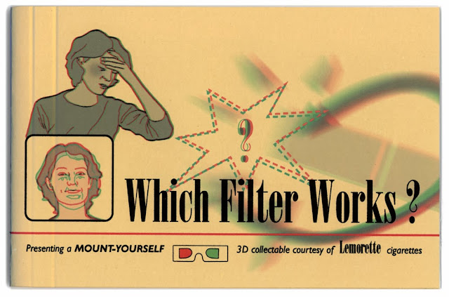
Artist's Books: Which Filter Works?


The book was produced in an edition of 7 printed on 130gm cartridge paper, the cover is yellow card and the cigarette cards are printed on glossy card. 3D Glasses accompany the book.
The book measures 190mm x 120mm.
This book was one of the elements within my practice-based PhD about anxiety in advertising.


The book Which Filter Works? began with the series of six cigarette cards, each one based on an existing factual diagram found within U.S. cigarette advertisements of the period. I felt the re-drawn diagrams needed to be placed within the context of a collectors book, the book was planned to parody the science and technology, of Filter-Tip cigarettes. My invented brand Lemorette was the focus, as if the book was a promotional item to introduce a new brand. The name Lemorette is mentioned as many times as possible. The tone of the book is instructional but rather patronising assuming the consumer is childlike in intellect. The consumer's children are encouraged to participate. 3D glasses are included in the front of the book. It was intended that viewing the book via the glasses should feel a little ridiculous.

For more information about the choice to use 3D imagery select The use of 3D section.
The book is in two sections, the first half is informational and offers advice and justifications, including headings such as;

A Doctor Speaks... 
This is a bogus endorsement from a medical specialist suggesting he has been paid to say whatever the manufacturers want him to.


What's 3D and why the funny-looking glasses
?
Explanation of how to view 3D, suggesting that the novelty glasses can enhance understanding.


Psychological fact: PLEASURE HELPS YOUR DISPOSITION
Double page chart intended to show how smoking more can ease anxiety, the title 'PLEASURE HELPS YOUR DISPOSITION' was used by Camel in their 1954 advertisements.


So what's wrong with cigarettes? / Worries melt away...
This diagram needs to be viewed by blinking each eye in turn, hence the diseases associated with smoking that appear listed above the woman's head fade away and the brand name Lemorette takes their place.
What's a filter anyway? / How do other brands compare? 
Although the title suggests that this section will explain what a filter is, the text goes on to skirt around the issue by taking about umbrellas and roofs, again speaking, as if to a child. The diagram needs to be viewed by blinking each eye in turn to see the Lemorette brand stopping all harmful lines from penetrating the body, closing the other eye shows tangled lines in the lung area when a different brand is smoked.


What about these rigorous tests? 
This double page pread shows a bar graph that is all but useless since it has no axis numerals. Instead the danger is shown by simply making the bars longer or shorter, the categories read 'safe', 'inert', 'concern', 'risky', 'dangerous' and 'deadly' but again no qualification of the measurements are given. Opposite is a cross-section of the Lemorette filtered cigarette, parodying the conventions of the cross-section diagrams that appear so frequently in Filter-Tipped brands' advertisements. The Lemorette filter is so complex that only about a sixth of the cigarette is actually tobacco. The filter names however are all genuine.


The second section is an image of a large extended cigarette - this is where the six cigarette cards are stuck-in. This section also has additional statistics and comments about the brand, it ends with a performance chart and image of the factory where Lemorette is supposedly made. The book ends on a final endorsement from Dr.Wolf about Lemorette 'The World's first SAFE Cigarette'.


About the use of 3D


I experimented with 3D imagery to give a 'gimmicky' feel to the book. The book was therefore created in red/green anaglyph 3D for a sense of cheap novelty. 3D glasses are included in the front of the book and the consumer is instructed when to put them on and take them off. Some diagrams require the viewer to close one eye and then switch to the other in order to get the hidden messages within the pages - Viewing the book should feel complex and yet embarrassing.
The section, What's 3D and why the funny-looking glasses? Seeks to explain how to view 3D, suggesting that the novely glasses can enhance understanding, whereas the over complex information instead seeks to cloud the issue and bedazzle the consumer.

There are two types of anaglyph illustrations used in the book;

  1. A composite image that appears to have several levels when viewed with the red/green glasses. e.g. the image of the Lemorette factory on p.20, A Doctor Speaks... the image of Dr.Wolf's endorsement on p.2 and all six of the separate stuck-in cigarette cards.
  2. Two separate images, one in green, the other in red viewed by opening and closing each eye in turn. e.g. the image of the woman on p.6 Worries melt away... , the diagram on p.7 What's a filter anyway? and the face in the rounded box on the cover of the book.
Shown below is 'What's a filter anyway? / How do other brands compare?'
This diagram needs to be viewed by blinking each eye in turn to see the Lemorette brand stopping all harmful lines from penetrating the body, closing the other eye shows tangled lines in the lung area when a different brand is smoked.
The illustrations (below) show how the illustration is seen in the green lense only (left) and the red lense only (right).


Creating Anaglyphs
I used Adobe Photoshop to separate my illustrations into about 6 layers and then created a red and green version of each layer. To make images appear closer to the viewer the red layer should be shunted to the right. In order to make the image recede the red layer should be shunted to the left.